
Holy moly it works. I can edit it through WP.Design System & Style Guide
This page exists so we can look at every core element the site uses — headings, paragraph text, lists, buttons, images, colors, and spacing — on one page, side by side, on desktop, tablet, and phone. It’s not linked in the site menu; it’s a working reference for spotting and fixing style inconsistencies across the rest of the site.
Typography
Heading 1 — Page Title
Heading 2 — Section Title
Heading 3 — Subsection Title
Heading 4 — Minor Heading
Heading 5 — Small Heading
Heading 6 — Smallest Heading
This is a standard paragraph of body text, styled with the site’s global font and size settings with no manual overrides. Use this paragraph as the baseline for what regular page copy should look like — font family, size, line height, and color should all match this everywhere on the site, on every screen size.
Lists
Bulleted List
- Climate-controlled storage units
- 24/7 gated access with individual codes
- RV, boat, and commercial vehicle parking
- On-site security cameras and lighting
Numbered List
- Choose your unit size and type
- Reserve online or call our office
- Sign your rental agreement
- Move in and get your gate code
Buttons
Standard button style, using the site’s global button settings with no per-page overrides:
Image Styling
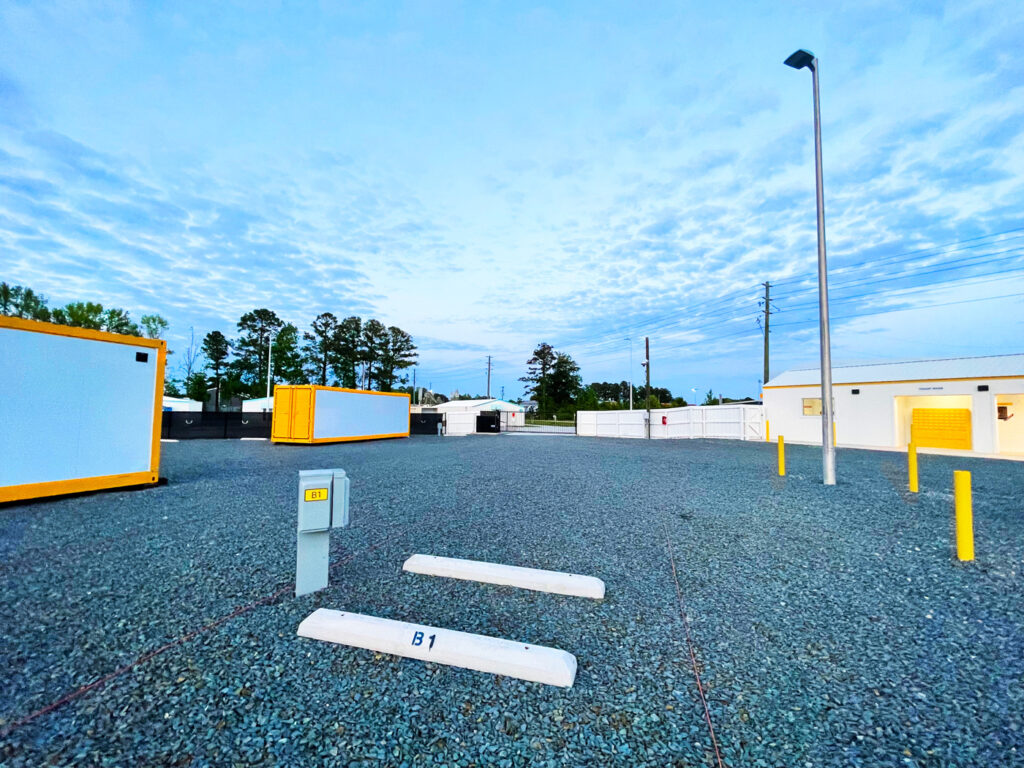
Standard content image, no manual size/crop/border overrides:
Brand Colors
Primary
#132F53
Secondary
#1360BD
Accent
#F9C014
White
#FFFFFF
Black
#000000
Standard Section Spacing
This section uses the site’s most common section padding — 60px top and bottom, 40px left and right on desktop. Compare this breathing room to other sections on the site to spot ones that are cramped or unusually spaced.